
ConKorgi is an app that seeks to help artists of all kinds find, apply to, and then register to events to sell their work. I was inspired to do this project by reading frustrated Twitter conversations between artists about their con experiences.
Any event that hosts an artist vendor space (ie, a comic book convention, craft fair, etc) manages the discovery and application process differently. Currently, the industry has no set standards, which can be a huge hurdle for creative people trying to get their work in front of a potential customer base.
My goal is to replace the difficult process that artists deal with to sell their work by giving them a platform to search for events, fill out applications, receive notifications of important dates, and complete registration.
I worked on this project alongside my Springboard mentor, who offered guidance throughout the entire process. I personally conducted user research, testing, data synthesis, personas, overall design and prototyping.
4 months
Overcoming familiarity and biases
Time

Before I did anything, I conducted a competitive heuristic analysis to determine whether or not my application was something that was needed. I had a hunch that there wasn't anything comparable available because I had seen demand online for an app like ConKorgi, but I wanted to be absolutely sure. Turns out there isn't, so I found applications that did individual aspects of what I was imagining for my product and continued my research.


I interviewed 5 people
2 were seasoned convention pros
3 were local artists that sell their work at events
I learned about the unpredictable nature of the convention scene and how finding events, local or not, can be difficult. There was a unanimous demand for standardization and transparency from those that run events. I compiled the information I had into an affinity map to discover common patterns from these conversations.
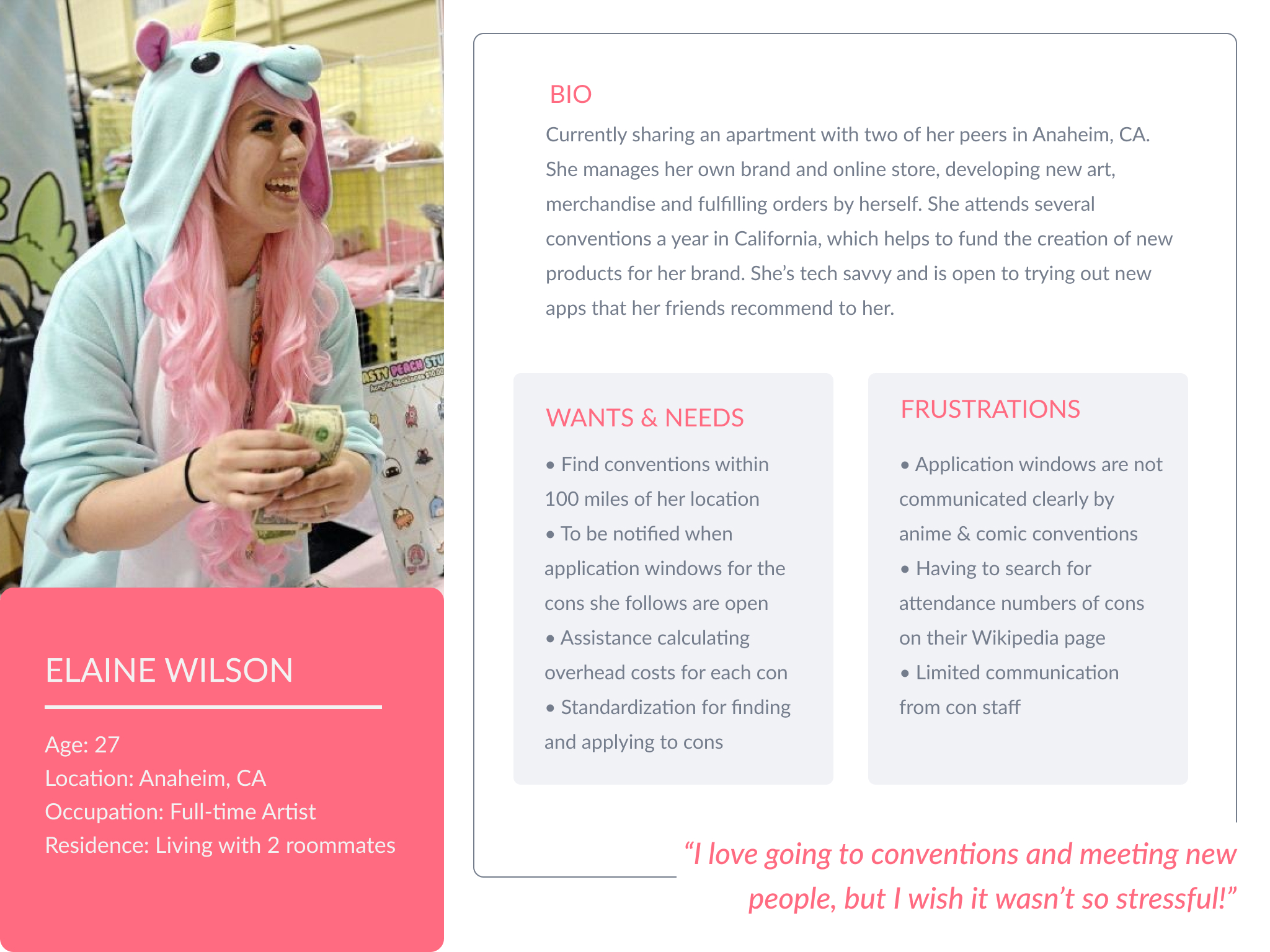
To build understanding and empathy toward my future users, I created empathy maps and then my two user personas: Elaine, a convention veteran, and Alex, an artist eager to connect to their local art scene.
With my user personas defined, I wrote out How Might We statements and sketched possible solutions to those problems.
HMW MAKE THE APPLICATION PROCESS EASIER?
HMW HELP ARTISTS FIND EVENTS THAT SUIT THEIR WORK?
HMW ENSURE THAT THE REGISTRATION PROCESS IS SIMPLE?
HMW INSPIRE ARTISTS TO ATTEND MORE EVENTS?


After choosing the critical routes of the application that I was going to focus on, I planned the general architecture of the content with a site map. This created a solid foundation for the next steps in the process of planning ConKorgi’s structure & design.
While I was deciding on the site’s structure, I also had to determine what my Minimum Viable Product was going to be. I honed in on the most needed aspects on the design first, focusing on the core aspects of my original idea and leaving enhancements of the experience for later.
SEARCH
CON PROFILES
APPLICATIONS
REGISTRATION
NOTIFICATIONS
.png)
Now that I had the general structure planned out and my MVP defined, I had to imagine how a user would operate my product. Even as a UX newbie I could tell that this part of the process was critical! I used Whimsical to plot out the user flow, taking care to keep interactions simple and concise.


Now the hard part was finished! At least that’s what I thought. It took a couple of rounds of sketches for me to translate the user flow into a design that I was happy with. I had a clear vision of my head of what I wanted ConKorgi to look like, and I think that actually made this process more difficult. After some guidance from my mentor, I was finally able to settle on something I was happy with. Once I finished the sketches, I jumped into Figma and created wireframes. Since I had spent so much time on the planning phase, transferring them into the digital realm wasn’t too time intensive!

Now that my ideas were visualized, I was able to get to the part that comes naturally to me as an experienced graphic designer. I made a moodboard on Milanote to get a general idea of what I was going for design-wise - I settled on bright, simple and friendly.
Using my moodboard as inspo, I went into Figma and created a style guide. I leaned towards a bold “night mode” palette using pink and purple, and chose a rounded sans serif font family that I would use throughout my entire design.
The process of transforming my wireframes into my final design was so exciting! After several rounds of feedback from my mentor I had a product that I was proud of.


Prototyping in Figma is a process that I’m still getting used to. Luckily the platform makes it so that it can be as complicated as you want it to be, so I kept my prototype simple.
Once I had a working prototype, I recruited 5 people to conduct user tests with.
2 were in person
3 were online (one unmoderated)
The COVID-19 pandemic starting taking hold in the US right as I started scheduling testing, so I only had the opportunity to do two in person before the lockdown began. Two more tests were online, which I found more difficult as I couldn’t see their screens as they completed tasks. The last test was unmoderated, which provided extensive feedback that I found extremely helpful.I made a few small changes according to what my users had reported, then tested it one more time with someone whose feedback I valued greatly.

I learned so much about UX and design throughout this process. I designed an early version of my app before Springboard, and the improvement is significant. Talking to artists and learning what they really want and need vs. making my own assumptions had a huge impact on the design of my product.
In reflection, I wish I had kept a design diary and logged my progress throughout the program. There are certain steps that I’m foggy on - I’m worried that it will be difficult to recollect in the future. Lesson learned! Documentation will be a priority of mine moving forward as an UX Designer.
I plan on making ConKorgi a reality some day. I truly believe that it would help artists all over the world attend more events and be more successful. I’ll be updating this case study as I flesh out of the remaining screens of the app. Here are a few upcoming features to look forward to:
MESSAGING
INVENTORY MANAGEMENT
PLANNER
PORTFOLIO
& MORE!
.png)
.png)


